BadgerCoin Marketing Site - Experimental Rebuild
I rebuilt the HoneyBadger/BadgerCoin marketing site from scratch to modernize the brand presence and create a maintainable foundation. The result is an Astro-powered site that ships mostly static HTML while hydrating small React islands for rich interactions like hero motion, reviews carousel, 3D scenes, and an interactive ATM map.

Homepage: hero with animated background, clear CTAs, and trust indicators
Live Preview
https://marketingsite-experimental.vercel.app/
https://marketingsite-experimental-git-fe2470-badgers-projects-0dea00d3.vercel.app/
Process
Competitive Research
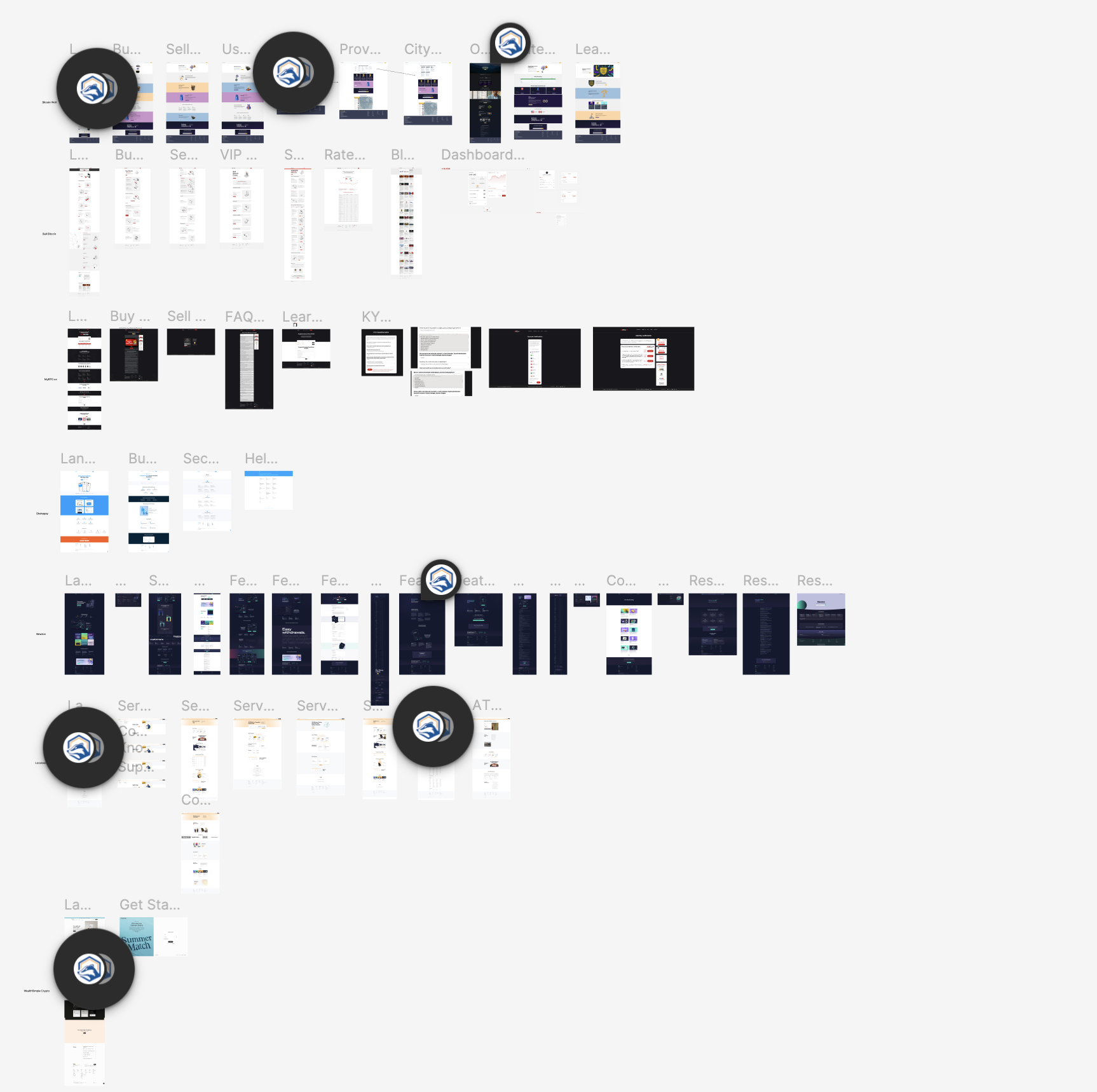
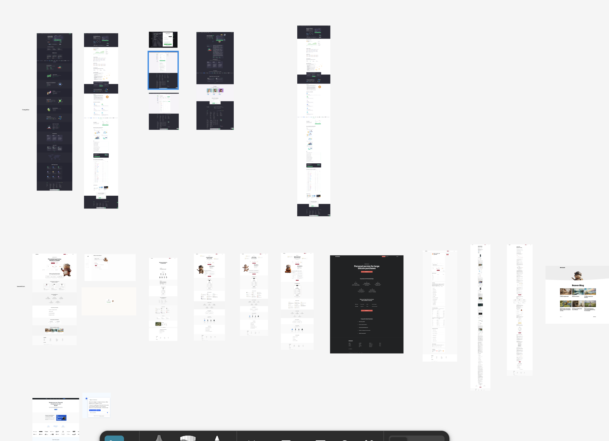
Dissected competitor sites in Figma, mapping structures, flows, and component patterns from established crypto platforms.
Wireframing & IA
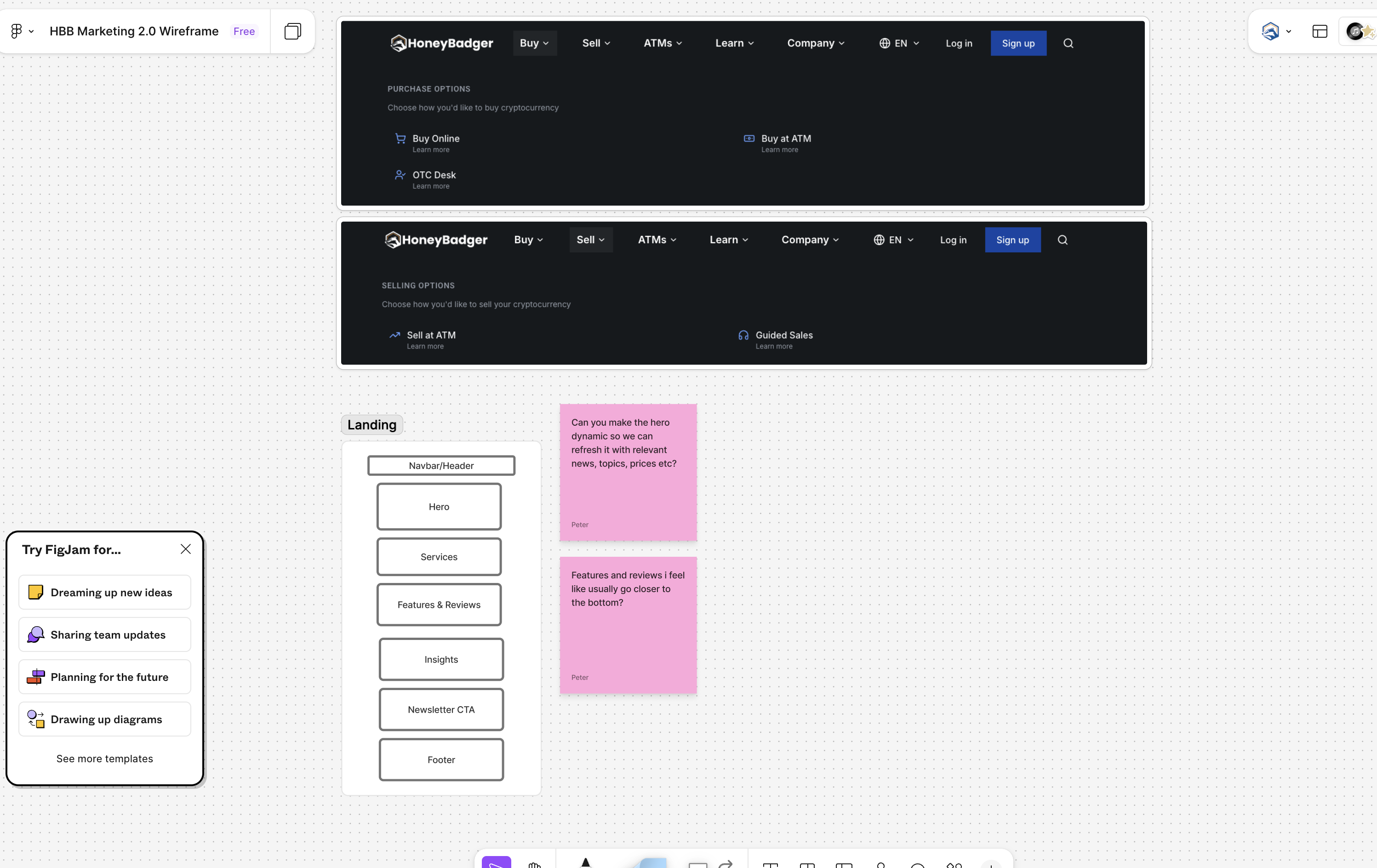
Low-fidelity wireframes for all pages in Figma, iterating on layout, content hierarchy, and responsive breakpoints before code.
Component & Design System
Built a design system with Tailwind tokens, custom fonts, and reusable components to ensure consistency across all sections.
Implementation
Built with Astro islands architecture using static HTML by default, hydrating only small React islands for interactivity (hero, menu, map, 3D).
Optimization & Launch
Media optimization (WebM/WebP), font loading strategy, Lighthouse audits, and Vercel deployment with analytics.
Tech Stack
- Astro 5: Static-first with island architecture for minimal JS on content pages
- React 19 + TypeScript: Hydrated only where needed (hero, menu, reviews, map, 3D)
- TailwindCSS 4: Utility-first styling with clean tokens and components
- Framer Motion & GSAP: Small, purposeful motion that enhances comprehension
- Three.js (R3F/drei): Selective 3D used where it adds value, with mobile budgets
- Leaflet (react-leaflet): ATM map mounted client-side with SSR guards
- Vercel Analytics & Speed Insights: Observability for performance and UX
Design Process & Thinking
Competitive Research & Teardown
Before building anything, I conducted a systematic teardown of competitor sites in Figma. I dissected site structures, flows, and component patterns from established crypto platforms to identify best practices and gaps.
- Structure analysis: Mapped information architecture, navigation patterns, and user flows across multiple competitor sites
- Component inventory: Catalogued reusable UI patterns (hero sections, trust badges, CTAs, footers) to understand industry conventions
- Flow documentation: Traced purchase flows, support pathways, and onboarding sequences to identify friction points
- Design system extraction: Noted typography scales, color palettes, spacing systems, and interaction patterns

Competitor site structure and component analysis in Figma

User flow and pattern documentation
Wireframing & Iteration in Figma
With competitive insights in hand, I wireframed the entire site in Figma, from landing page through support flows. This let me iterate quickly on layout, hierarchy, and content structure before writing a single line of code.
- Low-fidelity wireframes: Rapid sketching of page structures, section layouts, and content blocks
- Component planning: Identified reusable patterns (navbar variants, service cards, testimonial layouts) early
- Responsive considerations: Planned mobile, tablet, and desktop breakpoints with clear hierarchy shifts
- Content strategy: Defined messaging hierarchy, CTA placement, and trust signal positioning

Low-fidelity wireframes showing page structures, components, and responsive layouts
Design Principles
- Trust-first visuals: Conservative layout, sharp typography, purposeful color for a financial product
- Clear IA: Obvious paths for Buy, Sell, ATMs, and Support with consistent, scannable sections
- Performance as UX: WebM/WebP media, font loading strategy to avoid CLS, deferred interactivity
- Motion principles: Restraint, consistency, and feedback instead of gratuitous effects
Challenges & Solutions
Rich media without bloat
Kept pages static by default and hydrated only small islands. Encoded videos to WebM/H.264, lazy-loaded below-the-fold media, and used responsive sources.
Astro + React ergonomics
Used client:load and visibility directives selectively, kept props serializable, and rendered server-first wherever possible to keep JS budgets tight.
3D on mobile
Lazy-loaded R3F scenes behind intent, reduced poly counts and texture sizes, and swapped to lightweight video renders on small screens.
Leaflet in an island
Mounted react-leaflet client-side with SSR guards and minimal interaction logic. Cached tiles aggressively and trimmed bundle size.
Implementation Highlights
- Mega-menu, reviews carousel, and hero motion as small React islands
- Media pipeline with WebM/WebP and responsive sizes; fonts gated with the Font Loading API
- Composable sections with a consistent design system and tokens
- Targets: LCP < 2.5s on 4G, near-zero CLS, low TTI via island hydration
Outcomes
- 90–100 Lighthouse scores locally across core pages
- Sub‑30KB JS on content pages; islands loaded on demand
- Clear foundation for future product pages and content collections